Where Should You Place a Logo on a Polo Shirt?
Table of Contents
The left chest is the safest and most widely used logo position on a polo shirt. It is visible, professional, and suitable for corporate uniforms, golf apparel, clubs, schools, and retail collections. Sleeve and back-neck logos work well as secondary branding, while larger back or all-over designs are better for teams, events, and fashion-led polos.
At Mingxingpolo, we recommend choosing the logo position according to garment use, artwork size, decoration method, and how the polo will be viewed when worn.
Why the Left Chest Is the Most Popular Position
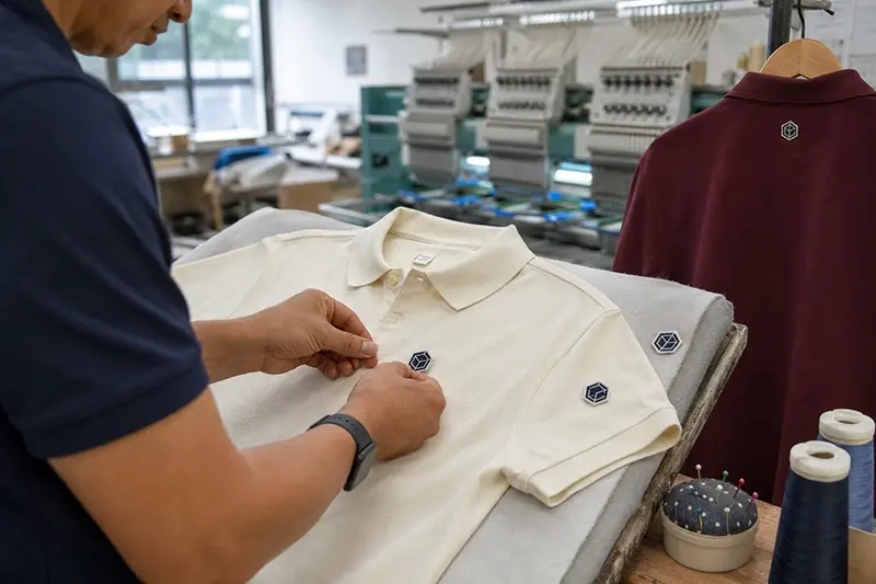
The left chest is the standard position for company logos, club badges, school emblems, and fashion branding. It gives the logo clear visibility without dominating the garment.
This placement works because it:
- Remains visible under most jackets
- Looks balanced beside the placket
- Suits embroidery and printing
- Works for both men’s and women’s polos
- Creates a familiar professional appearance
A common starting width for a left-chest logo is approximately 7–10 cm, or 2.75–4 inches. Small wordmarks may be wider, while shield-shaped or square logos may need less width.
The position should be measured from the garment center and shoulder area rather than placed by eye. If it sits too close to the placket, the front looks crowded. If it is too close to the armhole, the logo may appear hidden or distorted when worn.
Placement should also be checked on every size. Using exactly the same distance on XS and 3XL garments may produce inconsistent visual results, so slight position adjustments can be necessary across the size range.
Right-Chest Logo Placement
The right chest is a useful alternative when the left side already contains a badge, name, pocket, or sponsor logo. It is common in uniforms, teamwear, and event apparel.
For example, a polo may use:
- Company logo on the left chest
- Employee name on the right chest
- Club badge on one side
- Sponsor logo on the opposite side
When both sides contain decoration, the two designs should have similar visual weight. They do not need to be identical in size, but one should not overpower the other unless that is an intentional part of the design.
The right-chest position should mirror the general height of the left-chest logo. This creates a cleaner and more organised front appearance.

Sleeve Logo Placement
The sleeve is one of the best positions for secondary branding. It keeps the front of the polo clean while adding visibility from the side.
Sleeve logos are often used for:
- Sponsor branding
- Brand symbols
- Event logos
- National flags
- Team or department identification
- Certification marks
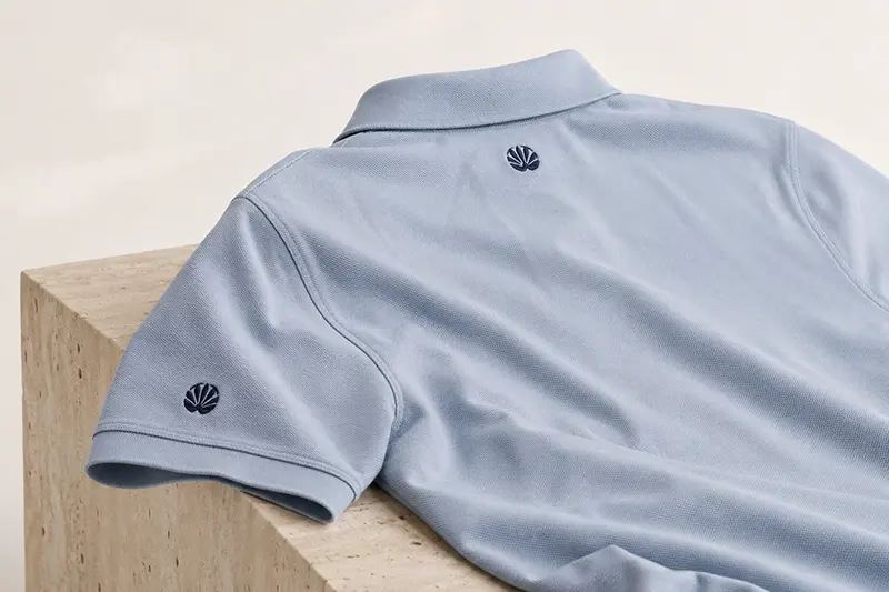
A sleeve logo is normally smaller than a chest logo. Approximately 5–8 cm wide is a practical starting range, depending on the artwork and sleeve length.
The design should sit around the centre of the outer sleeve rather than too close to the armhole or cuff. On a short sleeve, limited space means that both the logo size and position must be checked on the smallest garment size.
For custom corporate polo shirts, sleeve branding works particularly well when the company wants to include a partner logo or department name without making the front too busy.
Back-Neck Logo Placement
A logo placed below the back collar creates subtle brand recognition. It is popular for premium retail polos, golf apparel, lifestyle collections, and private-label products.
The back-neck area is best for:
- Small symbols
- Short wordmarks
- Brand initials
- Club names
- Simple embroidered icons
A width of around 5–9 cm is usually enough, although the correct size depends on the logo shape. The design should be centred below the collar with enough space to prevent it from looking attached to the collar seam.
Dense embroidery in this position may feel uncomfortable against the wearer’s neck, especially on lightweight fabric. Soft backing, a lower stitch density, or a printed method can improve comfort.
This placement is not as immediately visible as a chest logo, but it adds detail when the wearer is viewed from behind.
Logo Placement on the Collar
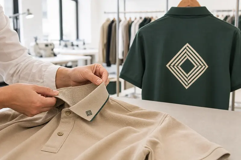
The collar provides a more fashion-focused branding position. A small embroidered word, symbol, or repeated jacquard design can make the polo feel more customised.
Common collar options include:
- Embroidery on one collar point
- A small logo on the collar edge
- Knitted jacquard lettering
- Contrast tipping in brand colours
- Branding under the collar
Under-collar decoration becomes visible when the collar is raised, making it better suited to golf, lifestyle, or fashion collections than formal uniforms.
Collar designs must remain small and simple. Heavy embroidery can affect the way the collar sits, while an oversized logo may make the garment look unbalanced.
If the collar already includes stripes, tipping, or jacquard details, adding another visible logo may create too much competition.
Large Back Logo Placement
A large logo on the upper or full back offers strong visibility. It is commonly used for staff working at events, delivery teams, sports clubs, promotional campaigns, and service crews.
An upper-back logo is usually positioned below the collar and between the shoulder blades. A full-back design can extend further down the body when greater visibility is required.
Large back designs are normally printed rather than embroidered because printing:
- Adds less weight
- Allows greater design detail
- Covers a larger area economically
- Feels less rigid during movement
Large embroidery can become heavy, stiff, and expensive due to its high stitch count. If an embroidered appearance is required, a patch may sometimes be more practical than direct embroidery.
For staff uniforms, the logo must remain readable from a reasonable distance. Short company names and bold lettering normally perform better than complicated artwork.
All-Over Logo and Pattern Placement
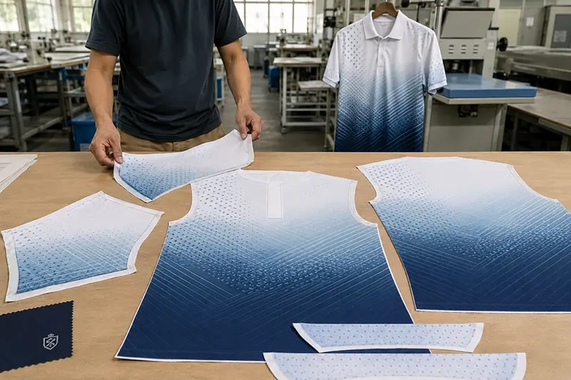
All-over printing turns the entire polo shirt into a branded design surface. This method is frequently used for sports teams, golf events, sponsor-led apparel, and modern fashion collections.
Possible applications include:
- Repeated logos
- Geometric patterns
- Gradient colour effects
- Sponsor arrangements
- Custom team graphics
- Branded sleeve and body panels
Sublimation is a common choice for all-over designs on white or light-coloured polyester. The artwork is applied before the garment is assembled, allowing the pattern to cover larger fabric panels.
However, seams can interrupt the artwork. Logos should not be placed directly across side seams, armholes, or placket edges unless minor alignment variation is acceptable.
For custom golf polo shirts, all-over patterns can create a distinctive retail or team look without adding a heavy layer to the fabric.
How Decoration Method Affects Placement
Embroidery and printing do not behave in the same way on every part of a polo shirt.
Embroidery works best on areas that can be secured in a hoop and supported with suitable backing. The chest, sleeve, and back neck are common choices. Areas close to thick seams, buttons, or narrow collar edges may be more difficult to embroider consistently.
Printing offers greater freedom for large or detailed artwork. However, flat and accessible surfaces produce the best results. Plackets, seams, folds, and textured piqué can affect print pressure and clarity.
Heat-transfer applications require controlled temperature and pressure. This is particularly important for polyester polos because excessive heat can cause surface marks or colour migration.
The selected Embroidery & Printing method should therefore be confirmed together with the fabric and placement, rather than treated as a separate decision.
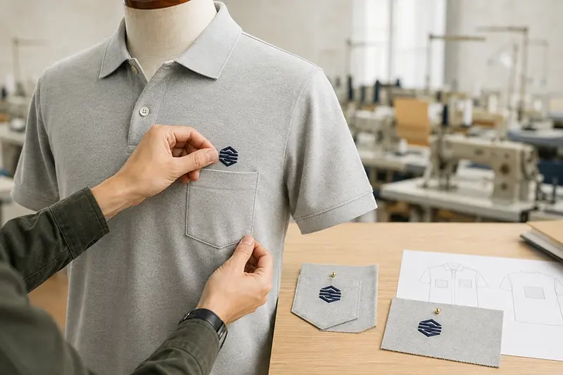
Should the Logo Be Placed Above a Pocket?
If the polo shirt has a chest pocket, the logo can be embroidered directly on the pocket or positioned above it.
A logo centred on the pocket creates a traditional uniform look. However, the usable decoration area may be small, and embroidery can restrict the pocket slightly.
Placing the logo above the pocket maintains pocket function but requires careful spacing. If the design is too close to the pocket edge, the front may look crowded.
Another option is to move the main logo to the opposite chest or sleeve. This can produce a cleaner result when the pocket is already a strong visual feature.
Common Logo Placement Mistakes
Poor placement can make a high-quality polo shirt look unprofessional. Common problems include:
- Positioning the chest logo too low
- Placing it too close to the placket
- Using the same placement measurement for every size
- Making a sleeve logo too large
- Adding dense embroidery to lightweight fabric
- Printing across uneven seams
- Using too many visible logo positions
- Ignoring how the design looks when worn
A digital mock-up is useful for reviewing the design direction, but it cannot fully show how the fabric hangs on the body. A physical sample provides a more reliable view of the logo’s scale, position, texture, and balance.
How Many Logo Positions Should You Use?
For most corporate and retail polos, one main logo and one secondary logo are enough.
A clean combination might include:
- Left chest plus sleeve
- Left chest plus back neck
- Right chest plus sleeve
- Chest embroidery plus printed back design
Using three or more visible logo positions can work for sponsored teams or event apparel, but it may feel excessive on a premium retail or corporate polo.
The logo hierarchy should remain clear. The main brand should have the strongest position, while partner, sponsor, or secondary branding should be smaller or less prominent.
What Should You Confirm Before Sampling?
Before producing a decorated sample, provide:
- Vector logo file
- Exact logo dimensions
- Pantone or thread colours
- Required placement
- Polo shirt size used for approval
- Fabric composition and GSM
- Decoration method
- Reference photo or mock-up
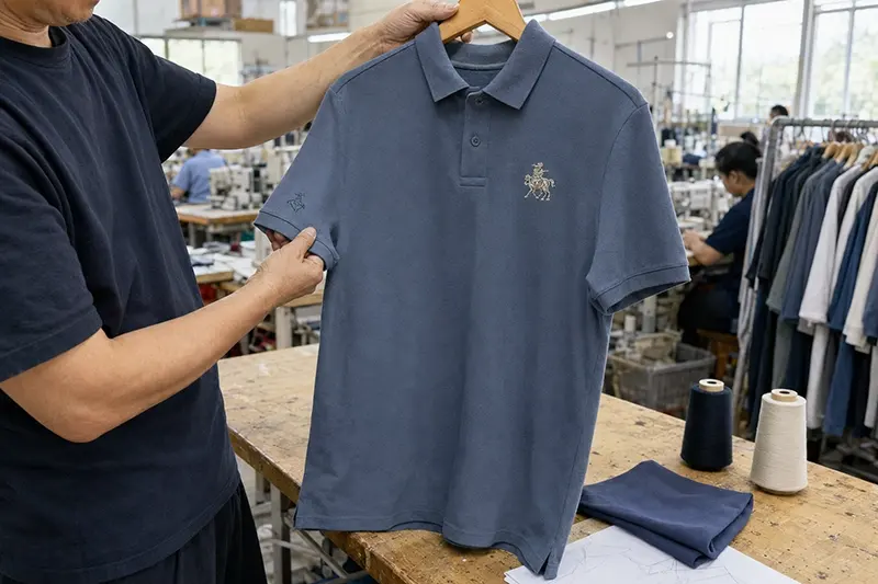
The placement should be recorded in the specification sheet using measurable reference points. Once approved, the sample and placement measurements become the standard for bulk production.
Final Thoughts
The left chest remains the best all-purpose logo position for polo shirts, while sleeves and the back neck are effective for secondary branding. Large back prints and all-over designs suit teams, events, and more expressive collections.
The best placement should look balanced on the garment, remain comfortable during wear, and support the intended brand image. To review your logo size, placement, fabric, and decoration method before sampling, contact us with your artwork and polo shirt requirements.
FAQs
What is the standard position for a polo shirt logo?
The left chest is the most common position. It provides good visibility and creates a professional appearance for uniforms, golf apparel, clubs, and retail polos.
What is a suitable size for a left-chest logo?
Approximately 7–10 cm, or 2.75–4 inches, is a common starting range. The final size should depend on the logo shape, garment size, and required visibility.
Can a logo be embroidered on a polo shirt collar?
Yes. Small and simple logos can be embroidered on the collar point or edge. Large or dense designs may affect the collar shape and should be avoided.
Should logo placement change between garment sizes?
The visual position should remain consistent, but slight measurement adjustments may be needed between very small and very large sizes.
Can one polo shirt include several logos?
Yes. Multiple logos are common for teams, sponsors, and event uniforms. For corporate and premium polos, limiting the design to one main logo and one secondary placement usually creates a cleaner result.
Share With
Related Articles



Hot Products